How to make Tool-tip arrow or dialog-arrow using css.
We have some cool, tool-tips on some websites,
This looks cool .
Here is the css to create this cool tool-tip arrow.

now the css
First will give css to div.
For this will use pseudo - selector :before and :after.
First will make give style to :after.
Now , our div looks like something as.
NOTE: 1:
if we give color like lightblue. then it will look like.

Now, we need to fix . this and get the covering border.
we , use :before.
Finally we get,

Below, is the link to the Fiddle . Feel free to play with it.
http://jsfiddle.net/lokeshjain2008/MdPUa/
Thanks, if you have suggestions, please comment.
This looks cool .
Here is the css to create this cool tool-tip arrow.
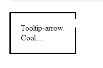
<div class="arrow_div">
Tooltip-arrow.<br/>
Cool....
</div>
now the css
First will give css to div.
<style type="text/ css">
.arrow_div{
display:inline-block;
margin-top:30px;
padding:20px;
border:3px solid black;
position:relative; /* This important to give position relative as we will be position arrow relative to this */
}
</style>
For this will use pseudo - selector :before and :after.
First will make give style to :after.
.arrow_div:after{
content:"" left,right;
border:10px solid transparent; /* this will have no effect */
position:absolute;
border-left:10px solid white; /* important give colors here. this will give the effect :NOTE 1 */
left:100%;
top:10px;
}
Now , our div looks like something as.
NOTE: 1:
if we give color like lightblue. then it will look like.
Now, we need to fix . this and get the covering border.
we , use :before.
.arrow_div:before{
content:"" left,right;
border:13px solid transparent;
position:absolute;
border-left:13px solid black; /* color of the main div and +width of main div's border */
left:100%;
top:7px;
}
Finally we get,
Below, is the link to the Fiddle . Feel free to play with it.
http://jsfiddle.net/lokeshjain2008/MdPUa/
Thanks, if you have suggestions, please comment.